Long John Silver’s wants customers to know there’s not just fish on its menu — but plenty of chicken, too.
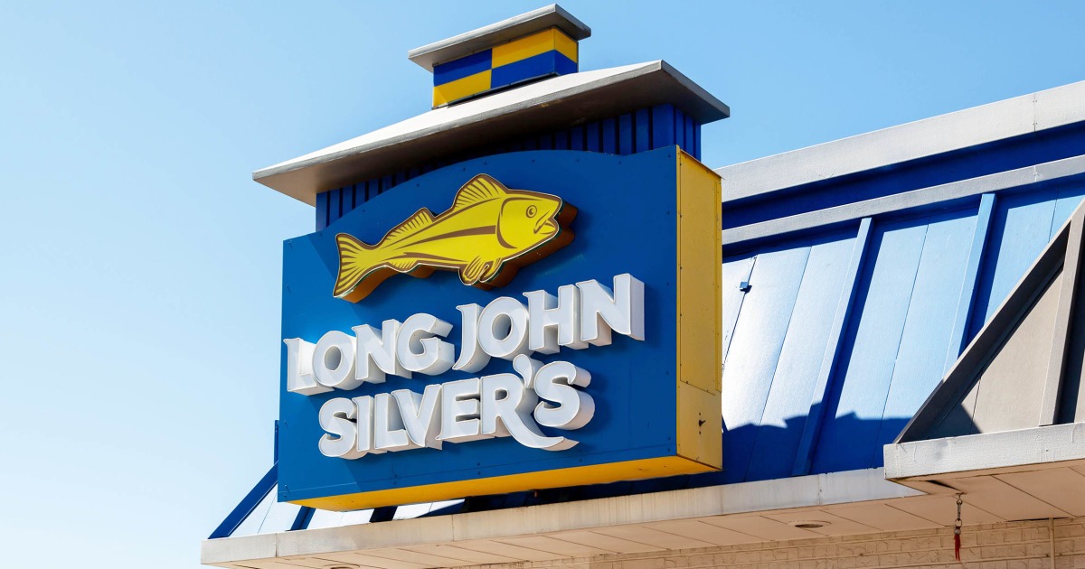
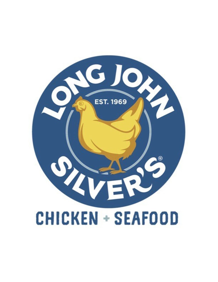
The fast-food chain, which specializes in fried seafood, announced in an Oct. 3 press release it was unveiling a new logo featuring a chicken — instead of its traditional fish — in its center.
The Louisville, Kentucky-based company also added the phrase “Chicken + Seafood” to the new logo.

The updated logo has already popped up on Long John Silver’s official website and social media accounts. It will also appear on a new chicken icon wrap on the Long John Silver’s Front Row Motorsports car during the South Point 400 car race at the Las Vegas Motor Speedway on Oct. 12.
And, in the coming months, the brand “will strategically roll out the branding across other properties and materials,” according to a Long John Silver’s spokesperson.
“Guests have been telling us for years that our chicken is a best-kept secret,” Christopher Caudill, Long John Silver’s senior vice president of marketing and innovation, said in the release. “Our hand-battered chicken strips — known as Chicken Planks — are every bit as crave-worthy as our legendary fish. It’s time we let that secret out.”
Long John Silver’s fish-to-fowl rebrand comes as chicken is having a real moment in the fast-food world. More and more restaurants, including McDonalds and Wendy’s, are adding or bringing back chicken items to their menus, to keep up with the fowl-focused folks at Popeyes and Chick-fil-A.
Chicken is the most popular protein in the United States, according to a consumer survey conducted by the National Cattlemen’s Beef Association last year.
The survey asked consumers to choose their favorite proteins, with chicken racking up of the votes 44%, followed by beef at 35%, fish at 12%, plant-based meat alternatives at 5% and pork at 4%.
It’s unclear whether or not this logo change is temporary or permanent, but in a statement to TODAY.com, a spokeperson called the “refreshed design” an “important addition to the Long John Silver’s branding” which “will be used moving forward to highlight our chicken offerings.”
“We believe that the new icon and corresponding ‘CHICKEN + SEAFOOD’ lockup accurately reflect the breadth of our full menu, which includes both crispy, tender chickenand delicious, mouthwatering seafood,” they added.
Long John Silver’s isn’t the only food and beverage chain to make headlines for a rebrand in recent memory.
Most recently, in September, the coffee company Maxwell House said it was rebranding to “Maxwell Apartment” to meet the needs of cash-strapped consumers in 2025.
And in more controversial news, Cracker Barrel altered its logo in August to get rid of the “Old Timer” leaning against a barrel, which led to such intense backlash, the brand ultimately reversed the change.
Back in 2018, IHOP also shocked customers when it changed its acronym name, which is short for the International House of Pancakes, to IHOB, short for International House of Burgers.
That surprising switch turned out to be a temporary marketing gimmick that lasted just a few short weeks.


